Microsoft and its Windows 8 is a popular topic in these days. I really like new and intuitive UI and software solutions but I was a bit pessimistic about the screen shots and videos I've seen of the new UI. It is based on the idea Microsoft had about the Phone 7 operating system so lets take a look how this works on a desktop computer.
Okay, so this is how Windows 8 looks after startup. Pretty new and different than we got used to. I'm using a 24" LCD so these tiles looks huge. I can use my computer at the maximum range of my wireless keyboard and mouse... but I don't want to. My first thought about it that a size adjustment would be good... maybe I'll find it somewhere in the options later.
So let's browse the web.
Hmm, our title part with URL field and buttons moved to the bottom... but why? Usually we start reading on the top (where we enter the website address) then looks below to the content, aren't we? This is weird, so weird. I'm curious about the final release that Microsoft will keep this layout or redesign it later. I still not feeling this UI right for a desktop computer.... it is good for a phone or a tablet anyway. I have an iPad so I have experience of using a tablet, and I can imagine this UI in my palm, but not on my desk.
It took me a while to realize how to exit from the browser, I was looking for an X or exit or quit buttons or ways but no luck... then I simply pressed windows button and voila, back to the initial tiles... great. We can scroll the tiles horizontally using the scroll wheel on the mouse... It feels a bit weird for the first time (scroll down on the mouse to scroll to the right on the monitor).
Let's try Explorer.
Wow, it jumped to the good and old desktop view. It seems Windows Explorer doesn't have a new UI yet to fit in the tiles layout as Internet Explorer, but Microsoft put the ribbon thing on it. It seems useful on the Explorer, much easier to see the functions compared to the old (hidden) menu layout. I personally don't like the ribbon interface on the Office product line anyway, too complex and it is hard to find functions for a not everyday Office user like me. I simply forget where to find some functions I need and also some frequently used functions need more clicks and navigation to reach. So it seems the Desktop is almost like the same as we get used to on Windows 7, except the start menu part. If we click on it, Windows shows the tiles as you see on the first screen shot.

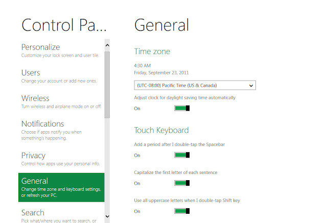
Control panel looks different to, it fits into the new UI design, looks pretty simple and clear. It seems we need to learn which function is where in Windows 8, as we had to do in Vista, fortunately we can switch back to the old control panel by clicking on the last "More Settings" menu. Using this, Windows switches back to the classic desktop view again.
As a Google Chrome user my first step on an empty system is to install it. I did this on Windows 8 too, it works well but of course in the classic desktop mode only. I'm curious about how the 3rd party browsers and other software will integrate into the new UI later.
Some useful shortcuts to use the new features:
- Win key - switch between the new tiles screen and the running application
- Win key + C - brings up the start menu, as shows some information and clock hover on the screen
- Win key + F - brings up the Search screen side menu
- Win key + Z - brings up the contextual menus for Metro-style apps
- Win key + D - switches to the desktop
- Win key + L - locks the computer and shows the new lock screen
- Win key + P - multi-monitor settings side menu
- Win key + I - brings up the Settings side menu
- Win key + Y - makes all open windows (and the Metro UI) transparent
I'll dig deeper in my follow up posts about Windows 8 in the system, we'll see how it works in the everyday usage.


